Icon design for games: sets that still work at 32 pixels
An icon has about a fifth of a second and a few hundred pixels to say what a thing is. Most game icon sets fail not because the drawings are bad, but because they were drawn large, one at a time, by different rules.
In this article
Open to new projects
Hadjoudj Idris
Game UI/UX Designer
Upwork100% Job Success
Hire me Browse the workIcons are the densest interface element in a game. A single inventory screen can hold sixty of them, each expected to be recognised instantly, at a size smaller than a fingernail, next to fifty-nine competitors. That is a harder problem than it looks and it is almost entirely solved before anyone draws anything pretty.
Silhouette first
Fill your icon with solid black and delete every internal detail. If it is still identifiable, the icon works. If it becomes a blob, no amount of shading, highlight or colour will save it at 32 pixels.
- Distinct outlines beat detailed interiors. A sword and a dagger with the same silhouette are the same icon to a player scanning a grid.
- Exaggerate the identifying feature. The part that makes a thing recognisable should be larger than reality allows. This is caricature, and it is the whole craft.
- Check the set together, not individually. Lay all of them out as silhouettes at final size. Any two that read the same are a problem, however different they look at 256px.
- Rotate to the most recognisable angle, which is rarely the realistic one. A helmet reads from the side, a potion from the front, a key at a slight angle.
The rules that make a set look like a set
Consistency is what separates a set from a folder of drawings, and it comes from a small number of decisions made once and defended everywhere.
| Decision | Made once | What breaks without it |
|---|---|---|
| Grid and canvas | One size, one safe margin | Icons that look randomly scaled next to each other |
| Stroke weight | One value, adjusted only optically | A set where some icons look bolder than others for no reason |
| Corner radius | One rule, matched to the UI | Icons that feel like they came from three different games |
| Fill or line | Pick one as the base language | Visual noise, and no way to use the other as a state |
| Perspective | Flat, or one consistent angle | A set that cannot be extended without guessing |
| Level of detail | A stated maximum | The first ten icons are simple, the last fifty are illustrations |
- Optical size beats mathematical size. A circle at the same pixel height as a square looks smaller. Adjust by eye, then lock the result.
- Keep a safe margin inside the canvas so nothing touches the edge, or icons will collide with their own containers and with each other.
- Draw on the pixel grid at your base size, so strokes land on whole pixels and stay crisp.
Design at the size it ships
The most common failure in game icon work is designing at 512 pixels and admiring it at 512 pixels. Every decision that looks refined at that size is invisible or muddy at the size a player sees.
- Work at your smallest real size, usually somewhere between 24 and 48 pixels, with a zoomed preview beside it rather than instead of it.
- Check at every size you ship, including the largest, since some icons appear at 128px in a detail panel and 32px in a list.
- Test on the target device. A handheld panel and a television are different problems.
- Export at the densities you need and check the smallest one, not the biggest.
- If it needs detail to read, it is the wrong drawing. Simplify the shape rather than adding pixels.
Icons are learned, not intuitive
Very few icons are genuinely universal. A magnifier, an X, a play triangle, a house, an arrow. Everything else is a convention players have learned from other software, and anything specific to your game is a convention you are asking them to learn now.
| Situation | Icon alone | Icon plus label | Label alone |
|---|---|---|---|
| Universal symbol: close, search, play | Yes | Unnecessary | No |
| Genre convention: inventory bag, gear settings | Usually | Safer in the first hour | Fine |
| Your invented resource or mechanic | Never at first | Yes | Acceptable |
| A dense grid where labels will not fit | Yes, with tooltips | Impossible | No |
| Anything destructive: sell, delete, discard | No | Yes | Yes |
| A HUD element under time pressure | Yes, once taught | Only if space allows | Rarely |
The reliable pattern: labels while the player is learning, icons once they are fluent, and both wherever the mistake is expensive. What the labels themselves should say is in the words in your game.
States, badges and overlays
An icon in a real game is rarely just an icon. Plan the layers before you draw, or you will retrofit them onto sixty finished files.
- States: default, hovered, selected, disabled, focused. Disabled is usually reduced opacity plus desaturation, never colour alone.
- Ownership and progress: locked, new, equipped, upgraded, favourited. Each one needs a position, and the positions must be consistent across the whole set.
- Counts and stacks, which need a reserved corner and a background plate so the number survives over any icon.
- Cooldowns and durations, usually a radial or linear wipe. That is a treatment applied over the icon, so it must not obscure the silhouette.
- Rarity or tier, which is where most sets accidentally become colour-dependent. Pair it with a border shape or a frame, per game UI accessibility.
- Reserve the corners deliberately. Four corners, four possible badges. Decide what owns each one once.
Colour in icons
- A monochrome base set is more flexible than a full-colour one, because it can be tinted per state, per team and per rarity without redrawing.
- Full colour suits item icons, where the object's own material identity is the point, and suits nothing else particularly well.
- Do not mix the two languages carelessly. Colourful item icons beside flat monochrome interface icons is fine and deliberate; a random mix within one row is not.
- Keep the accent for state. If your accent colour means selected, it cannot also be the colour of the fire icon.
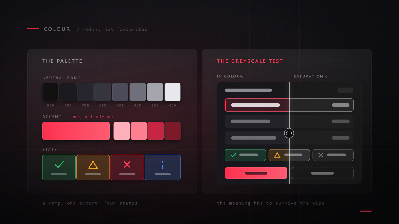
- Check the whole set desaturated, which is the fastest way to find icons that only work because of hue.
A family that survives its two hundredth icon
Sets rarely fail at icon ten. They fail at icon eighty, when the original rules have been forgotten and a different person is drawing.
- Write the rules down: canvas, margin, stroke, radius, angle, detail ceiling, corner reservations. One page.
- Build a template file with the grid, the safe area and a live preview strip at every shipping size.
- Keep a naming scheme that sorts:
icon_item_sword,icon_ui_settings,icon_status_poison. Searchable beats readable, per prefabs, variants and a Unity UI kit. - Maintain a contact sheet of the entire set at final size, updated as it grows. It is the only way to spot drift.
- Draw the hardest icons first. If the rules survive the abstract concepts, they will survive the swords.
Nobody notices a good icon set. They notice the one icon that was drawn by different rules.
Export and atlas
- Export at the sizes you ship, not one master that gets scaled at runtime, unless the engine handles it well and you have checked the smallest result.
- Consistent padding. Uneven trimming makes icons appear to shift position when they are swapped.
- Group into atlases by feature or screen, because a list drawing from six atlases breaks batching on every row. That is the draw-call cost in why your Unity menus tank the frame rate.
- Keep the vector source, organised and named to match the exports, so the set can be re-cut for a new platform without redrawing.
- Ship a monochrome variant if you have any chance of needing tinting later. Producing it up front is minutes; retrofitting it is a week.
An icon audit
- Lay the whole set out at final size on one sheet. Does it look like one set?
- Fill every icon black. How many pairs are now indistinguishable?
- Desaturate the sheet. What stops working?
- Measure the stroke weight on five icons. Do they match?
- Find the most detailed icon and the simplest. Is the gap deliberate?
- Check every badge and overlay position for consistency.
- View the set at the smallest size you ship, on the target device.
- Ask someone who has not played to name ten icons. Count the misses.
- Check the disabled state is not colour alone.
- Count how many atlases a single busy screen pulls from.
What size should game icons be?
Design at the smallest size they will actually appear, commonly 24 to 48 pixels, and export at every size you ship. What matters more than the number is that the drawing is judged at ship size rather than at the size you are drawing it, because detail that reads at 256 pixels disappears at 32.
Should icons have labels?
Universal symbols do not need them, genre conventions usually survive without them, and anything invented by your game needs them at least while players are learning. Always label destructive actions. A dense grid can rely on icons plus tooltips, but only if the icons are genuinely distinct in silhouette.
Flat icons or detailed illustrated ones?
Interface icons should be flat and simple because they are read at speed and at small sizes. Item icons can carry illustration and material detail because they represent objects and often appear larger. What causes problems is mixing the two languages within the same row without a reason.
How do I keep a large icon set consistent?
Write the rules down, build a template with the grid and a live small-size preview, maintain a contact sheet of the whole set, and draw the abstract concepts first. Sets drift when the rules live only in the head of whoever drew the first ten.
How much does a game icon set cost?
It scales with count and complexity rather than linearly, since the rules and the template are most of the work on the first ten icons and almost none of it on the next fifty. A small interface set is a few days; a large item set with states, badges and rarity treatments is a few weeks. The pricing logic is in the cost article.
Can I buy an icon pack instead?
For a prototype, absolutely. For a commercial release, a pack will give you generic shapes that do not match your art direction, will not cover your invented mechanics, and will appear in other games. A common hybrid is a bought set for universal symbols and a commissioned set for anything specific to your game.
Hadjoudj Idris
Game UI/UX Designer, Remote, worldwide
Need this done properly on your game?
Menus, HUDs, a full UI system, or one screen that isn't working. Tell me what you're building and I'll tell you honestly whether I'm the right fit, and what it would cost.
Upwork100% Job Success