UI animation: motion that helps, and motion that shows off
Good interface motion is invisible: the player knows where they are and never waits. Bad interface motion is the first thing a reviewer mentions, and it is almost always the same handful of mistakes made with good intentions.
In this article
Open to new projects
Hadjoudj Idris
Game UI/UX Designer
Upwork100% Job Success
Hire me Browse the work"Make it feel more polished" is one of the most common briefs a game UI designer receives, and motion is usually what is meant. It is also the layer most often added at the end by whoever has time, which is how games end up with menus that are beautiful once and irritating by the twentieth opening.
What motion is for
Three jobs. Anything that does not do one of them is decoration, and decoration on a screen the player opens forty times an hour is a cost.
- Continuity. Showing where a thing came from and where it went, so the player builds a mental map of the interface rather than experiencing a series of unrelated screens.
- Attention. Directing the eye to what changed, which is far more effective than making the changed thing bigger or brighter.
- Confirmation. Telling the player their input registered, which is covered as its own subject in how a game tells the player it heard them.
Motion that exists because it looked good in the mockup fails all three, and it fails them repeatedly, because interface is the one part of a game the player sees on every single session.
Duration and easing as a system
Pick a small set of durations and easings, write them down, and use only those. Motion timed per screen by taste is how a game ends up feeling inconsistent without anyone being able to say why.
| Movement | Duration | Easing |
|---|---|---|
| Button press and hover response | Under 100 ms | Linear or fast ease-out. It must feel instant |
| Small element entering: toast, tooltip, badge | 150 to 200 ms | Ease-out: fast start, gentle settle |
| Panel or modal opening | 200 to 300 ms | Ease-out |
| Anything leaving | Roughly two-thirds of its entrance | Ease-in. Exits should not be admired |
| Full screen transition | 250 to 400 ms | Ease-in-out |
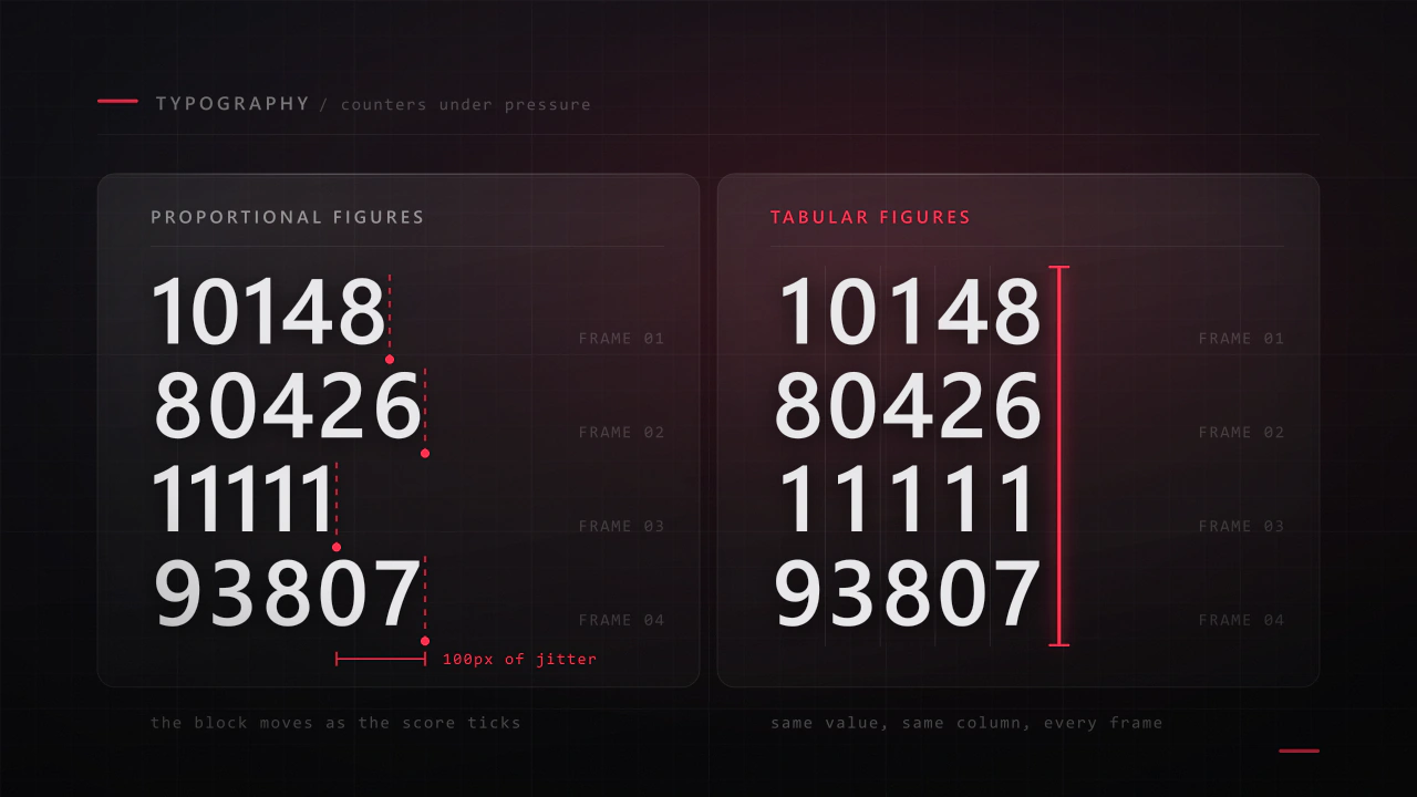
| Value counting up: score, currency | 300 to 800 ms | Ease-out, and skippable |
- Ease-out for entrances, ease-in for exits. Things arriving should decelerate into place; things leaving should get out of the way.
- Larger elements need slightly longer, because they travel further and a fast large movement reads as a jolt.
- Never linear for movement. Linear motion is the single clearest tell of unconsidered animation, and it is why default engine tweens look cheap.
- Overshoot sparingly. A small bounce suits a playful game and undermines a serious one, and it always costs time.
- Two or three durations is enough for a whole game. Fast, normal, slow.
Transitions that say where you came from
On a small screen especially, transition direction is often the only navigation cue the player gets. Making it consistent turns a set of screens into a place.
- Going deeper moves in one direction, coming back moves in the opposite one. Pick left-right or forward-back and never mix them.
- Modals grow from the thing that opened them where you can, so the connection is explicit.
- Tabs slide the direction the tab sits. Selecting a tab to the right should bring content in from the right.
- The back transition mirrors the forward one exactly. An asymmetric pair makes an interface feel unstable.
- Never cross-fade navigation. A cross-fade says these two things are the same screen changing, not you moved.
Animate the frame, not the content
The most common performance-adjacent mistake in interface motion, and the one that makes games feel slow rather than smooth.
- Never animate the thing the player is waiting for. If they opened the inventory to check an item, the item list should be there immediately. Animate the panel around it.
- Content fades in fast or not at all. A 400 ms fade on the data the player came for is 400 ms of delay wearing a costume.
- Do not animate layout. Moving and resizing containers is expensive and it makes text reflow mid-animation. Animate transform and opacity, which is also the cheap path in most engines.
- Let input interrupt. A player who presses a button during a transition should get the result, not wait for the animation to finish. This is the difference between an interface that feels responsive and one that feels like it is negotiating.
Stagger, and when it becomes a queue
- A small stagger reads as life. Twenty to forty milliseconds between items in a list gives a sense of arrival without feeling sequenced.
- A large stagger becomes a wait. Ten items at 100 ms each is a full second before the last one exists.
- Cap the total. Whatever the item count, the whole group should finish within about 400 ms. Stagger the first few and bring the rest in together.
- Never stagger something the player can act on immediately, or they will click an item that is still moving.
The tenth time, and the hundredth
Interface animation is reviewed once, in a slide, by people seeing it fresh. It is experienced hundreds of times by players who are not. That gap is where most motion complaints come from.
- Make every celebration skippable, with a press that both skips and proceeds. Level-up flourishes, reward reveals, results screens.
- Consider decay. The first unlock can be theatrical; the fiftieth should be brief. Some games reduce the sequence after a few repetitions and nobody complains.
- Watch the death screen especially. A long animation after a failure is the moment sessions end, per difficulty, failure and the moment players quit.
- Time the loop. Open the most-used screen, do the thing, come back. Add up the animation. If the round trip costs two seconds and happens forty times a session, that is your motion budget spent badly.
Idle motion: the first thing to cut
- Continuously animating idle elements pull the eye repeatedly toward information that has not changed. It is the opposite of what motion is for.
- Pulsing to draw attention works once, then becomes noise the player learns to ignore, at which point it is worse than nothing.
- Looping backgrounds and parallax on menus are fine in the front end and expensive on a HUD, both in attention and in battery.
- If it must breathe, make it slow and low contrast. Fast, high-contrast idle motion competes with the game.
Motion and performance
- Prefer transform and opacity. They are cheap in every engine; animating layout properties is not.
- In uGUI, an Animator per button costs every frame it is enabled, even idle. Use the built-in transitions or code tweens instead, per why your Unity menus tank the frame rate.
- Animating text is expensive, because the mesh regenerates. Animate a container holding the text where you can.
- Stop animations when their screen is hidden, which is free and frequently forgotten.
Specifying motion in a handoff
Motion is the part of a design that most often arrives as "make it nice" and comes back wrong. A spec removes the guesswork and takes minutes per transition.
| Field | Example |
|---|---|
| Trigger | Player presses Inventory |
| Property | Panel position and opacity |
| From and to | X +40px and 0 opacity, to X 0 and 1 |
| Duration | 220 ms |
| Easing | Ease-out |
| Delay or stagger | Content 60 ms after the panel; rows staggered 30 ms, capped at 6 |
| Interruptible | Yes: input during the transition completes it immediately |
That block, once per transition type rather than once per screen, is what turns a design into a build. It belongs alongside the states and anchors in designing game UI for Unity.
Every animation is a small tax the player pays each time. Charge it only where they get something back.
Reduced motion
- Offer a reduced-motion setting that shortens or removes interface transitions. It is a small feature that makes the game playable for people who get motion sick and welcome for everyone else.
- Reduced does not mean instant and jarring. Keep short fades, drop movement and parallax.
- Respect the platform setting where one exists, particularly on mobile.
- Keep camera shake, blur and screen effects as separate toggles, per game UI accessibility.
A motion audit
- Record the path from the main menu to your most-used screen and back. Add up the time spent animating.
- Count the distinct durations in your interface. More than four is a system problem.
- Look for anything linear. Fix it first.
- Open a screen and try to act during the transition. Does it accept input?
- Find the content the player came for. Is it animating, or is the frame?
- Trigger your reward flourish five times. Is it skippable?
- Watch a HUD for thirty seconds without playing. What is still moving, and why?
- Check the back transition mirrors the forward one on three screens.
- Profile a menu opening on the target device.
- Turn on reduced motion, if you have it, and check nothing became unusable.
How long should a UI animation be?
Between about 150 and 300 milliseconds for most interface movement, under 100 for a press response, and up to 400 for a full screen transition. Exits should be faster than entrances. If a number feels arbitrary, the test is whether the player ever waits for it.
What easing should game UI use?
Ease-out for anything arriving, ease-in for anything leaving, ease-in-out for full screen transitions. Avoid linear for movement, since it is the clearest tell of default engine tweening. Keep the whole game to two or three easing curves.
Why does my menu feel slow even though it is fast?
Usually because the content the player wanted is animating rather than the frame around it, or because the interface refuses input during transitions. Show the data immediately, animate the container, and let a press interrupt and complete the animation.
Should reward and level-up animations be skippable?
Yes, always, with a press that skips and proceeds in one action. Whatever is delightful on the first viewing becomes an obstacle by the fiftieth, and unskippable celebration is one of the most consistent complaints about progression-heavy games.
Is UI animation worth the budget on a small game?
A small amount is worth a lot: press states, panel transitions with consistent direction, and a fast fade. Those are days of work and they carry most of the perceived polish. Elaborate signature animations are the part to cut first, and the priority order is in indie game UI on a budget.
Who should build the UI animation, designer or engineer?
Either, provided the design specifies property, from, to, duration, easing, delay and whether it is interruptible. Without that spec it gets invented at build time and comes back inconsistent, which is the most common reason a well designed interface feels unfinished in the game.
Hadjoudj Idris
Game UI/UX Designer, Remote, worldwide
Need this done properly on your game?
Menus, HUDs, a full UI system, or one screen that isn't working. Tell me what you're building and I'll tell you honestly whether I'm the right fit, and what it would cost.
Upwork100% Job Success