A complete player journey for a neon racing concept: career hub, garage, race setup, HUD, inbox, controls and loading, built as one consistent design system from wireframe to final art.
Role
Game UI/UX Designer
Year
2026
Tools
Figma, Unity
Genre
Racing, Action
Platform
PC & console
Overview
In this case study
Nocturne Drive is a futuristic racing game UI concept focused on creating a clean, immersive, high-performance interface. The objective was to design an experience that gives players information instantly while keeping the excitement and speed of competitive racing.
The project covers the complete player journey: loading the game, navigating the main menu, configuring races, customising vehicles, managing career progression, and the in-race HUD.
It is deliberately one continuous session rather than seven separate mockups. The calendar on the career hub points at the Monaco GP; race setup configures a five-lap sprint at Monaco in overcast weather; the HUD shows lap 2 of 5 in that same race; and the inbox has the team captain asking for the Monaco data to be reviewed. Designing it as a single run is what exposes whether the system actually holds together, rather than whether each screen looks good alone.
Scope
Nocturne Drive is a self-directed concept, so the design is mine end to end: every screen and wireframe, the style guide, and the Nocturne Drive logo and wordmark. The vehicle and environment photography is reference imagery, used to present the interface in a realistic context rather than as original art.
The challenge
Racing games present a unique UI challenge: players need access to large amounts of information without overwhelming the experience. The interface must stay readable at high speed while still delivering a premium automotive aesthetic.
Screens
01
Loading
The first thing the game shows, and the only screen that carries the Nocturne Drive wordmark on its own. A blurred pass over the garage art keeps the world present without competing with the foreground, and the status line names the thing actually being loaded rather than showing a bare percentage, so the wait reads as the game preparing itself instead of dead time.
02
Career hub
The hub brings progression, game modes, notifications and account information into one interface. The centre is a single either/or — start a new career, or resume the one in progress with its season, stage and completion state spelled out — so the main decision is never more than two cards wide. Everything ambient sits in the strip along the bottom: mail, the next race on the calendar, options and quit, all reachable from any screen that uses this frame.
03
Race configuration: the car
Step one of the solo race flow. The searchable catalogue sits left, the configurator right, and the car itself holds the centre, so the thing being decided about is the thing you are looking at. Top speed, acceleration, braking and handling stay on screen while browsing, which lets a swap in the catalogue be judged immediately instead of remembered, and the four customisation routes are grouped beneath them rather than buried behind another screen.
04
Race configuration: the track
Step two, in deliberately the same frame: same navigation, same title bar, same utility strip, same two-panel split. Only the contents change, so moving between the two steps costs no relearning. Track map, race type and weather group on the left, difficulty and lap count on the right directly above the commit button, which lets the whole configuration be read left to right and ends on a single primary action.
05
Gameplay HUD
The same race the previous screen configured, now at speed. Position, lap and race type stack in the top-left, timing sits top-centre, and the tachometer holds the bottom-right corner, so the centre of the screen — the road and the cars being chased — is never covered. Only the values that change under pressure are given colour; everything else stays neutral, which is what keeps the readout scannable in peripheral vision at 165 kph.
06
Inbox
A centralised place for race updates, progression rewards and team communications. The master-detail layout lets a player browse the list and read a message at the same time, cutting the back-and-forth navigation that inboxes usually force. Filters sit above the list rather than in a menu, and the rewards attached to a message are shown as discrete items with the claim action separated from reply and delete, so the valuable button is never adjacent to the destructive one.
07
Controls
Two levels of navigation without nesting: the settings category on the left, the input device across the top. An illustrated diagram maps every binding onto the hardware itself, so a player reads their controller rather than a table of names, and the callouts are split down both sides to keep lines short and untangled. Rebinding is one button below the diagram, in the same place for every device.
08
Style guide
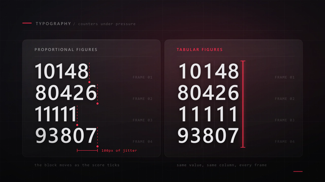
The whole system runs on two typefaces and three colours. Hemi Head Bold is the display face, wide and angular enough to carry the automotive tone in headings, mode names and numerals; Lucida Sans Unicode Regular handles body copy, where legibility matters more than character. White carries primary text and the highest-priority values, and beyond it the whole interface runs on two accents: the cooler 5BB0CC and the lavender A8A1FF, both pulled from the neon in the environment art so the UI sits inside the world rather than on top of it. Holding a palette this narrow is what lets colour mean something on the HUD, where the only coloured values are the ones that change under pressure.
Process
High-fidelity wireframes
Every screen was resolved in greyscale first: hierarchy, spacing and navigation locked before a single colour decision was made. They run in the same order as the screens above, so each one can be read against its finished counterpart.
Final thoughts
This was a really fun project to put together. It was a great challenge to think through every single screen a player might interact with and make sure they all felt connected. More than anything, it taught me how important it is to build a consistent design system that not only looks good but serves the player at every step.
Related reading
The thinking behind this
Longer write-ups on the craft this project drew on.