01
The full package
Main menu, settings, level select and the exit dialog as one cohesive set.
Arcade racing, UI package
A high-octane arcade racing UI package: glossy candy-finish buttons, custom sliders, level select and a themed exit dialog, all built on a vibrant red palette.
In this case study
This is a UI design package I created for a racing-themed video game. My goal was an interface that feels fast, exciting and visually polished, built around a vibrant red palette, glossy finishes and dynamic shapes that capture the speed and adrenaline of a racing game.
The set covers the full journey: main menu with clear Play, Settings, Credits and Exit actions; a settings panel with custom-designed sliders for music and graphics; a level selection screen with navigation arrows; and a styled "Exit Game?" confirmation. Every button, icon and window was designed to look and feel like it belongs together.
I started by sketching black-and-white layouts to lock the composition and make sure everything fit together before jumping into detail.
Once the structure was in place, the real fun began. I wanted a look that screamed arcade racing, so I went with a glossy, almost candy-like finish for the buttons and panels. It gives the UI a satisfying, tactile feel. The bright red scheme brings energy, while the 'Backpack' typeface adds a stylised touch that fits the arcade theme.
Main menu, settings, level select and the exit dialog as one cohesive set.
From the initial layout sketch through to the final coloured assets.
Panel construction, button states and the glossy finish applied consistently.
Custom sliders, navigation arrows and icons, all sharing the same corner radius and highlight logic.
I'm really pleased with the final result. This was a great challenge in building a UI set that feels fun, polished and full of high-octane energy.
Related reading
Longer write-ups on the craft this project drew on.
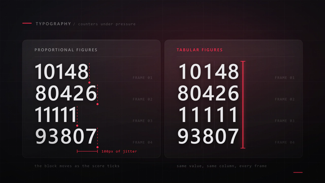
Interface type is read in half a second, at speed, over moving artwork, by somebody who did not come to your game to read. Almost every rule that applies to a book works against you here, and the fixes are specific.
Read the article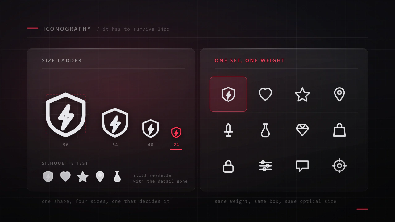
An icon has about a fifth of a second and a few hundred pixels to say what a thing is. Most game icon sets fail not because the drawings are bad, but because they were drawn large, one at a time, by different rules.
Read the articleContact
Menus, HUDs, full UI systems or a single screen that isn't working. Tell me what you're building and I'll tell you honestly whether I'm the right fit.