Figma
War
FPS
Here’s my take on a UI/UX design for a gritty, modern tactical shooter I'm calling "WAR." I really wanted to design an interface that felt as intense and immersive as the game itself. My goal was to create something that looked and felt like military tech but was still super clean and easy to use with a controller, making sure nothing pulled you out of the action.
The big question for me was: how do I make a UI that looks tough and realistic without it being a cluttered mess? I needed it to work for everyone, from new players who need a bit of guidance to the hardcore veterans who want to dive deep into stats and settings. I also wanted to create a really strong, recognizable logo and visual style that would be consistent across every single screen.
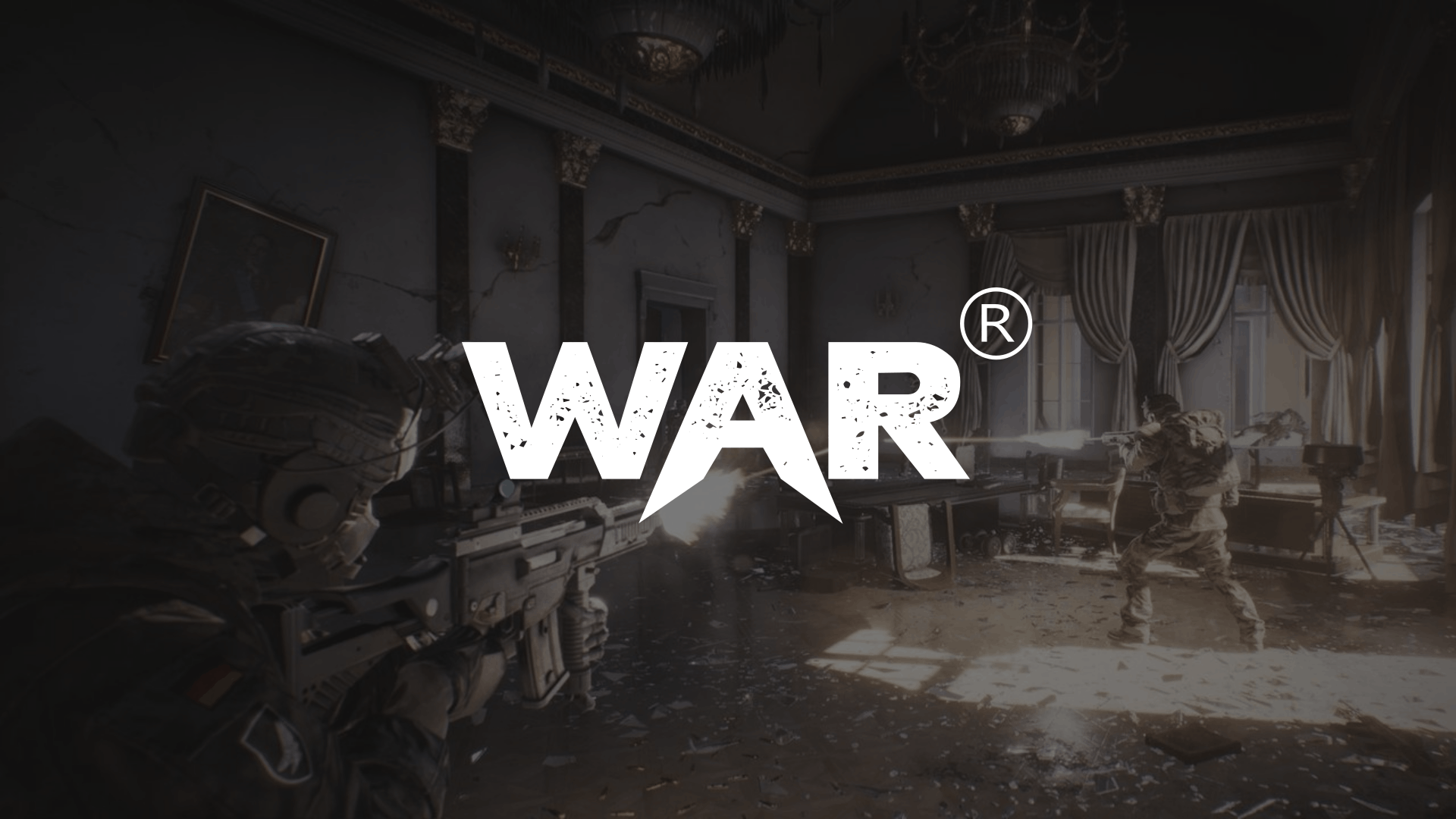
It all started with the logo. I needed something bold and aggressive. I ended up creating this custom font with a sharp cut through the "A" to give it that feeling of action and conflict. Setting it against a dark, cinematic scene really sets the tone from the moment you launch the game.
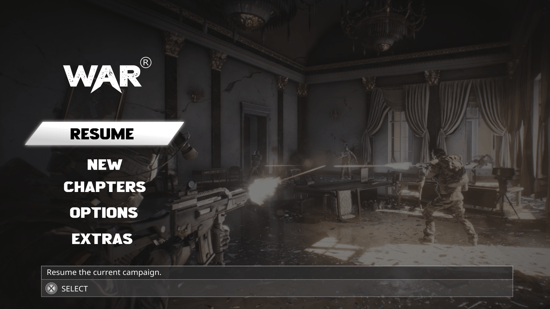
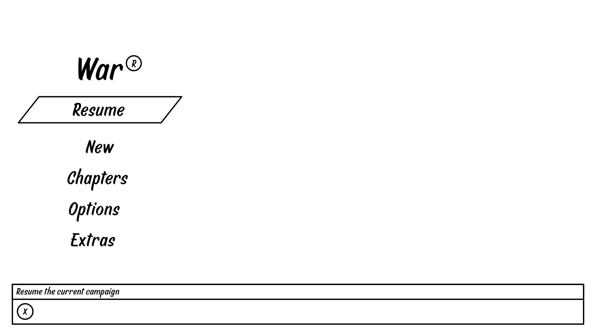
I designed the menu to feel clean and focused, with “Resume” as the default since most players just want to jump back in. Each option shows a short description on hover to keep things clear without cluttering the screen. It’s all about quick, intuitive navigation that matches the game’s intense, no-nonsense vibe.
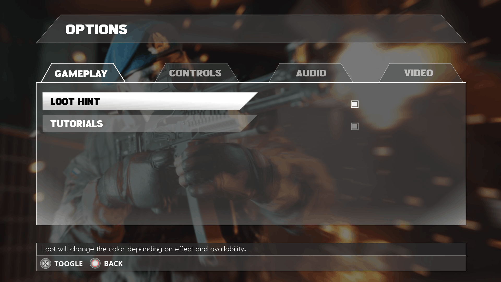
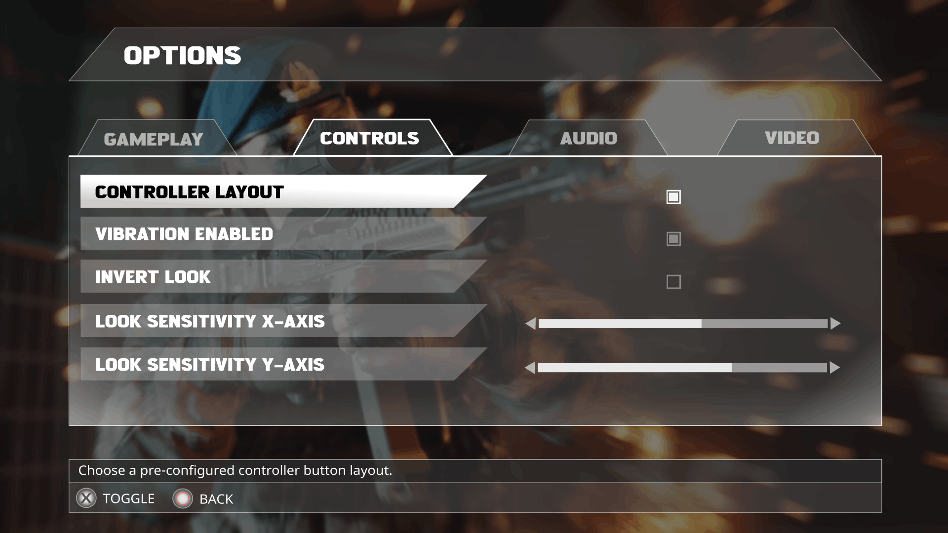
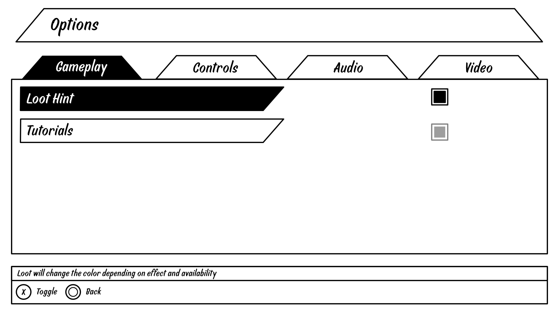
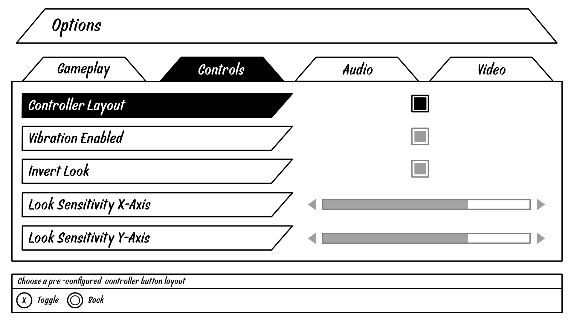
I can't stand digging through endless lists for a simple setting. That’s why I broke the options into clean, simple tabs: Gameplay, Controls, Audio, and Video. You can quickly get to what you need, whether it's tweaking controller sensitivity or just turning on subtitles.
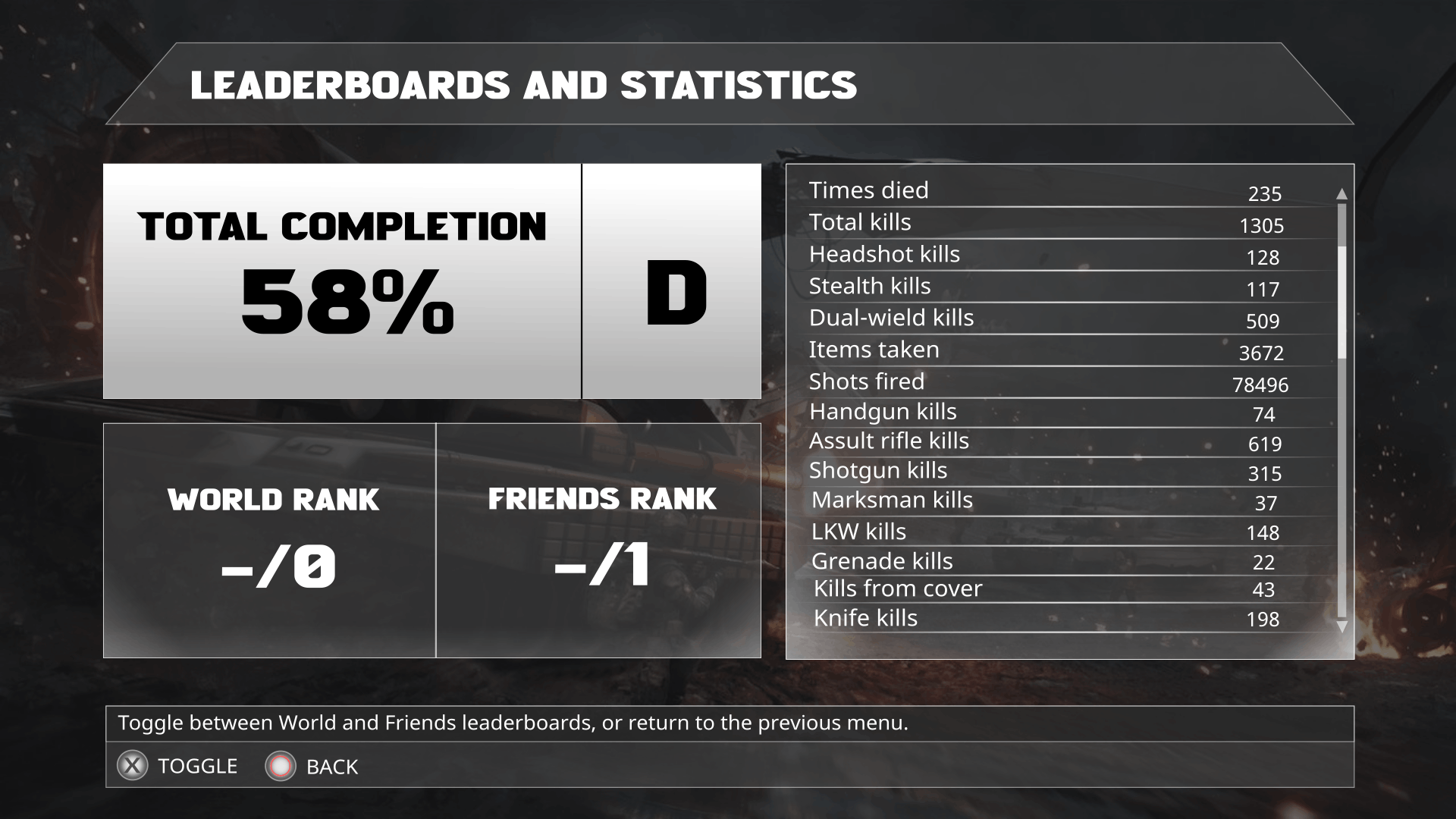
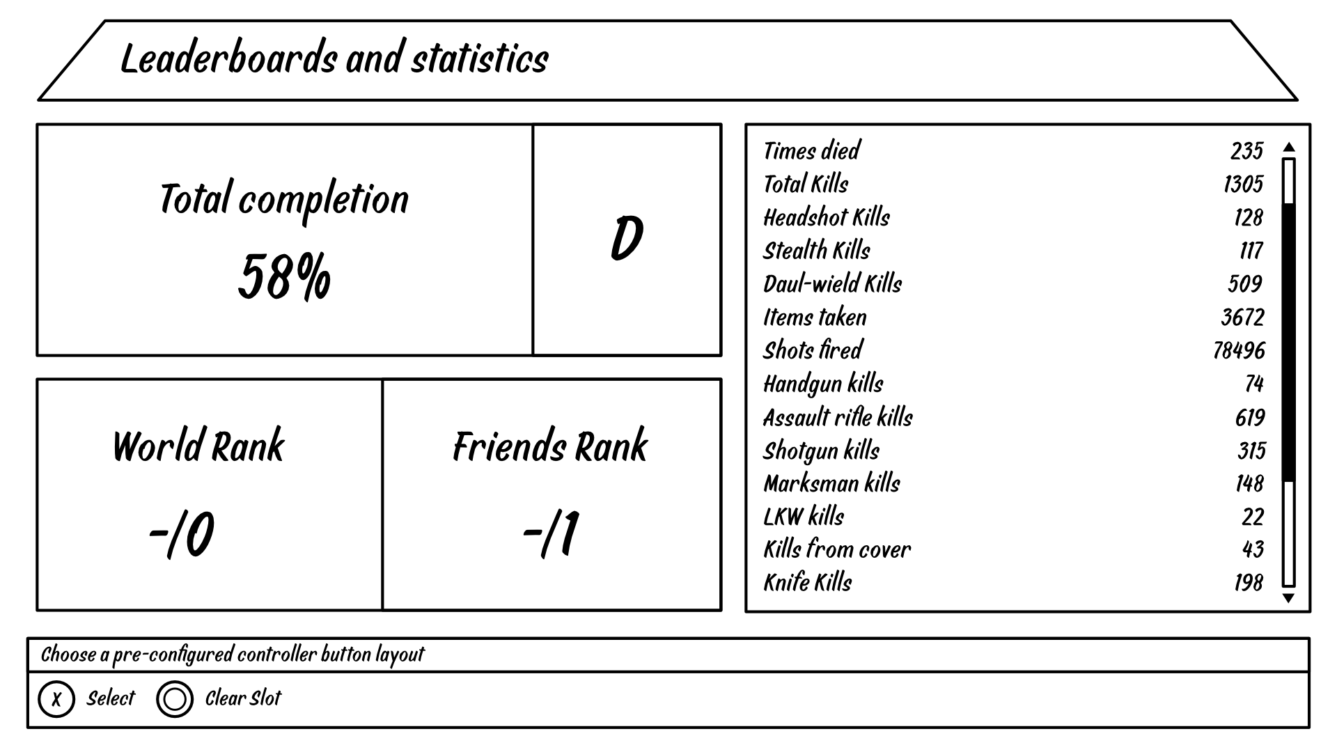
As a gamer, I know how much players love to track their stats. I designed this screen to show you the big picture at a glance—like your total completion and rank—while also giving you a super detailed breakdown of your entire performance on the right. It’s all there, but it doesn't feel overwhelming.

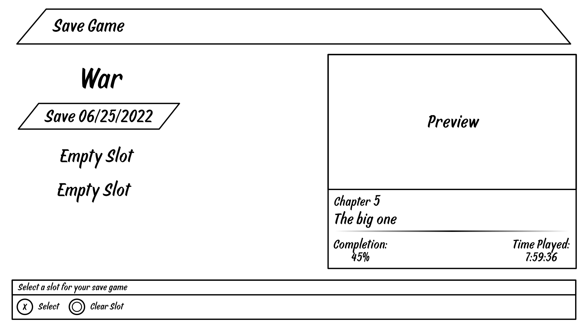
There's nothing worse than loading the wrong save file. I designed this screen to give you all the info you need to avoid that: a screenshot, the chapter name, how far you are, and your playtime. It makes picking the right save quick and foolproof.

I'm really proud of how this project turned out. It was a great challenge to build an entire visual identity from scratch and see it through to the smallest details of the interface. More than anything, it was a fantastic exercise in taking a ton of complex information- stats, settings, save files, and presenting it in a way that feels clean, intuitive, and looks completely at home within the game's world.

Drag and Drop Website Builder