Affinity Designer
FPS
Sci-Fi
As a lifelong Star Wars fan, I’ve always been drawn to the visual storytelling of the galaxy far, far away. For this project, I set out to design a full UI/UX concept for a modern, story driven action adventure game. I challenged myself to strike a balance between staying true to the iconic Star Wars aesthetic gritty, tech heavy, cinematic and using clean, modern design techniques like minimalist layouts and bold, readable type. It was important to me that it felt like something new, but still instantly recognizable to fans..
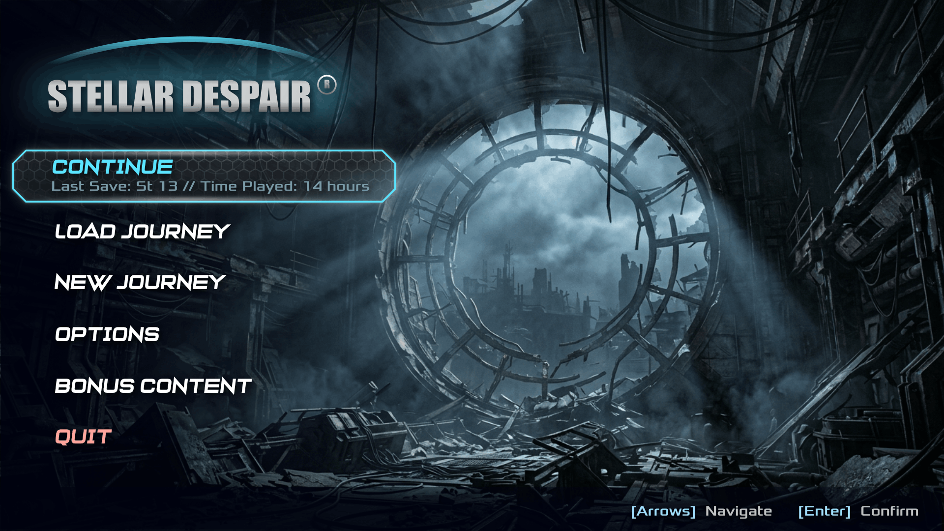
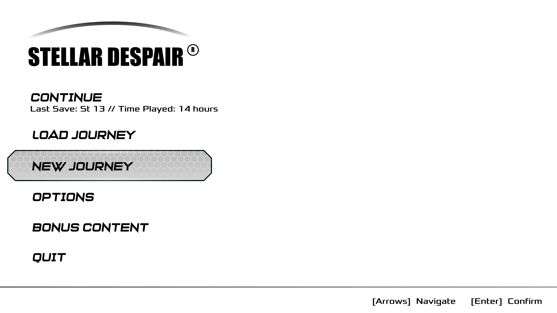
The main menu establishes the visual identity of Stellar Despair while providing quick access to the game's primary features. The layout prioritizes clarity by separating navigation from contextual content, allowing players to immediately identify their next action. A bold sci fi aesthetic, subtle transparency, and consistent spacing reinforce the game's dark futuristic atmosphere without compromising readability.
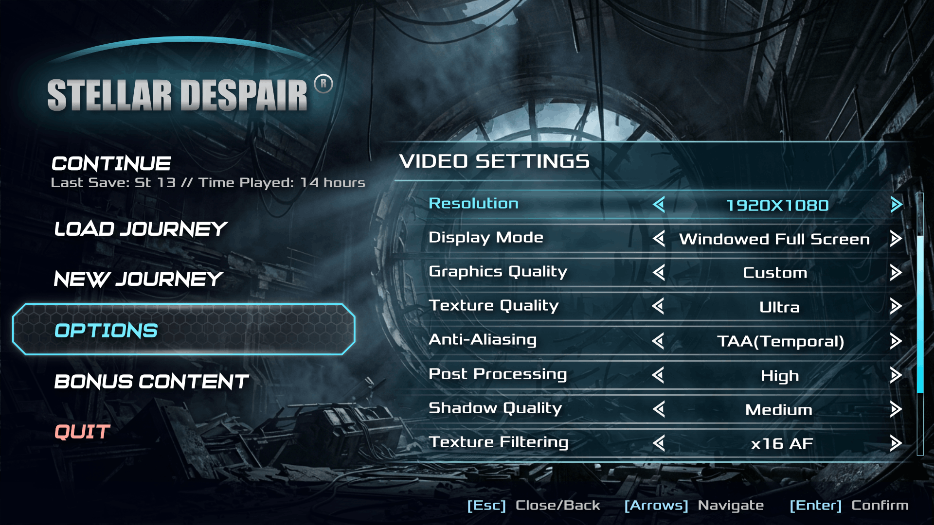
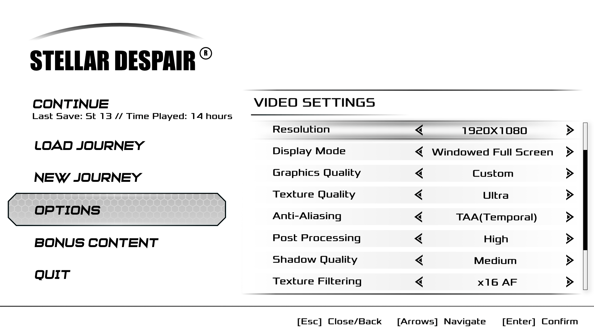
The settings interface was designed to simplify access to a large number of graphics options without overwhelming the player. Each setting follows a consistent row structure with clear labels, directional controls, and generous spacing to improve readability. The interface supports both keyboard and controller navigation while maintaining visual consistency with the rest of the UI system.
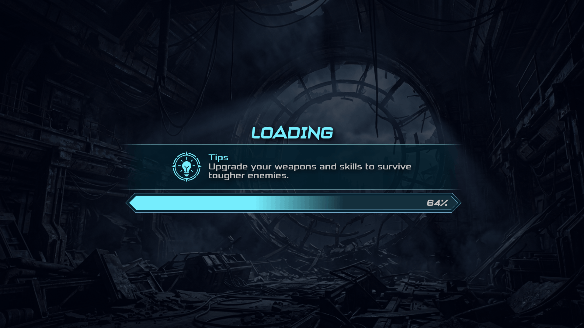
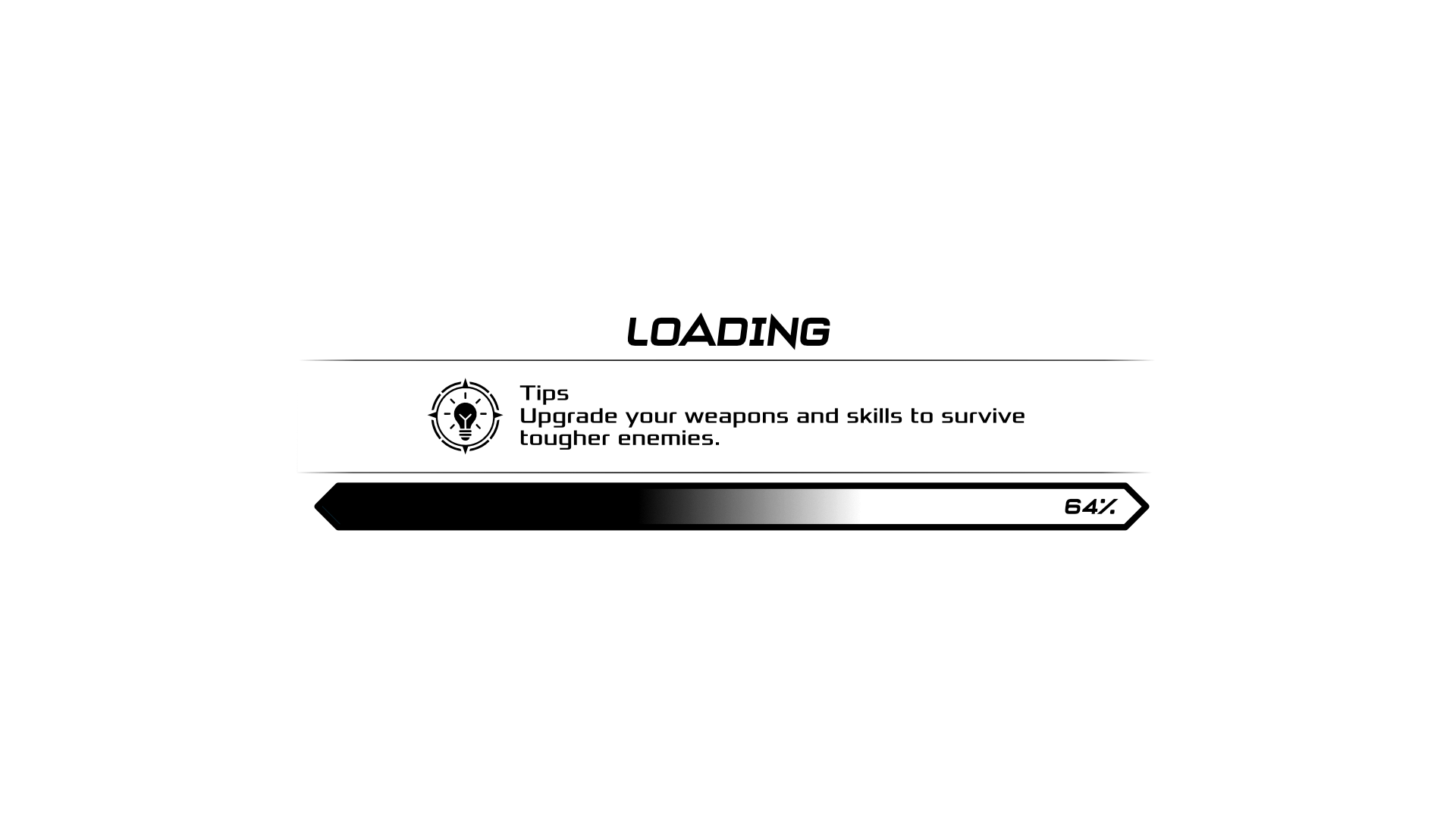
The loading screen keeps players engaged during transitions by combining progress feedback with gameplay tips. A minimal interface reduces visual clutter while the large progress indicator provides clear status information. The design maintains the game's atmosphere and creates a seamless transition between gameplay sessions.
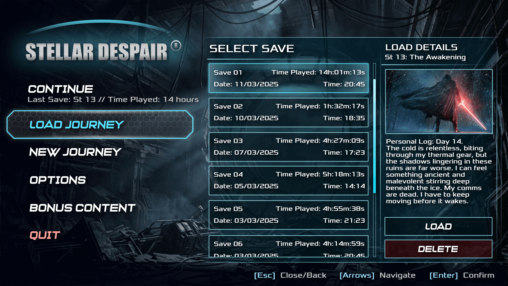
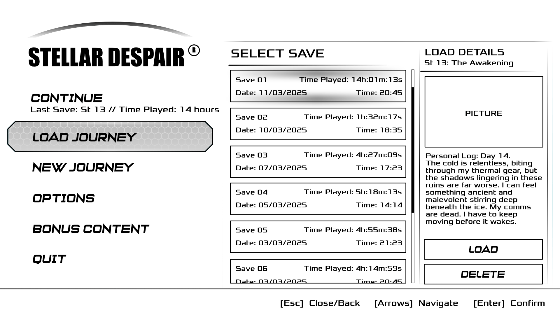
The save management screen allows players to quickly compare and manage multiple save files. Each save entry presents key information, including chapter, playtime, date, and preview image, making it easy to identify the desired save at a glance. Primary and secondary actions are visually separated to reduce accidental inputs while keeping the workflow intuitive.
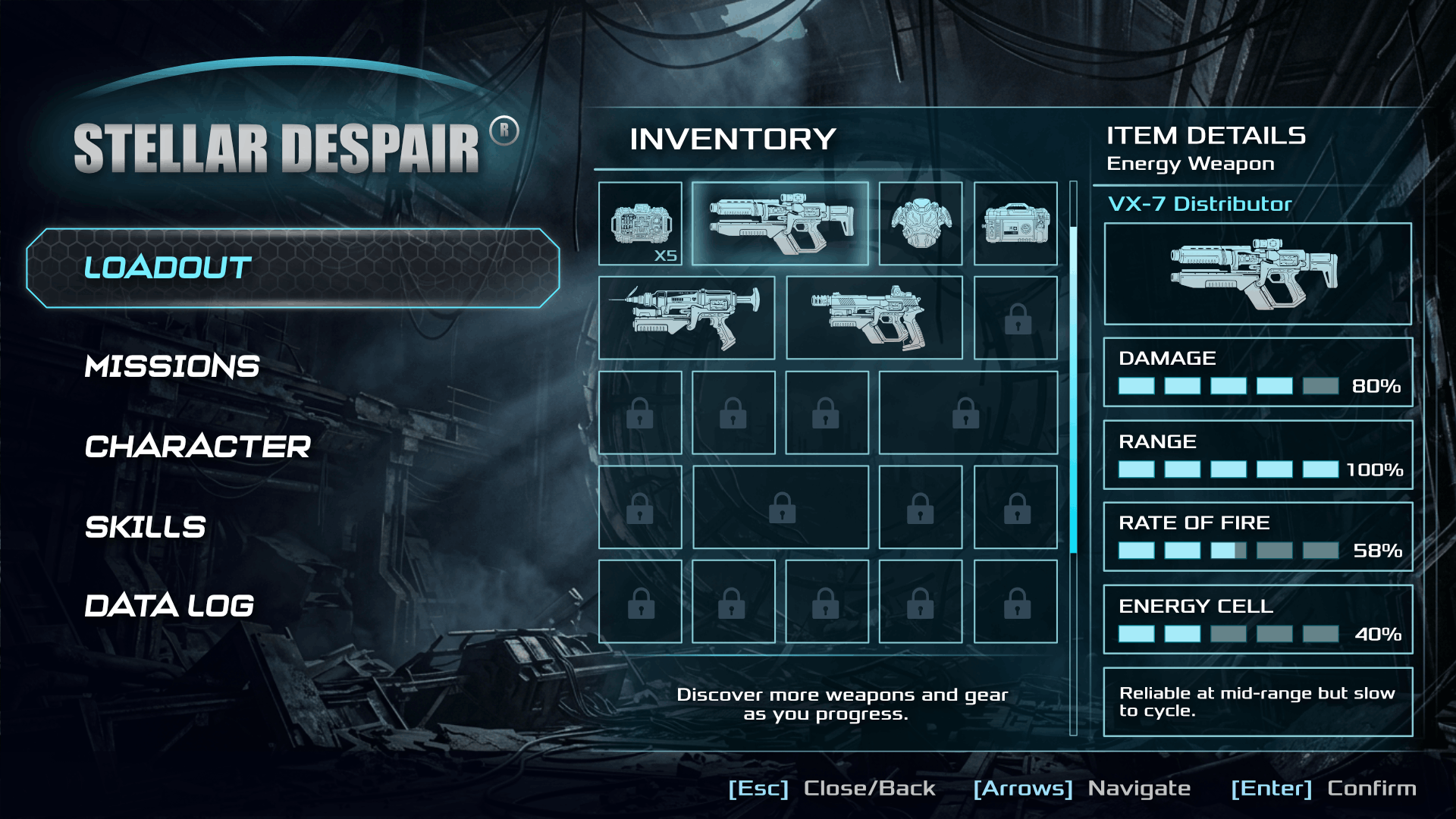
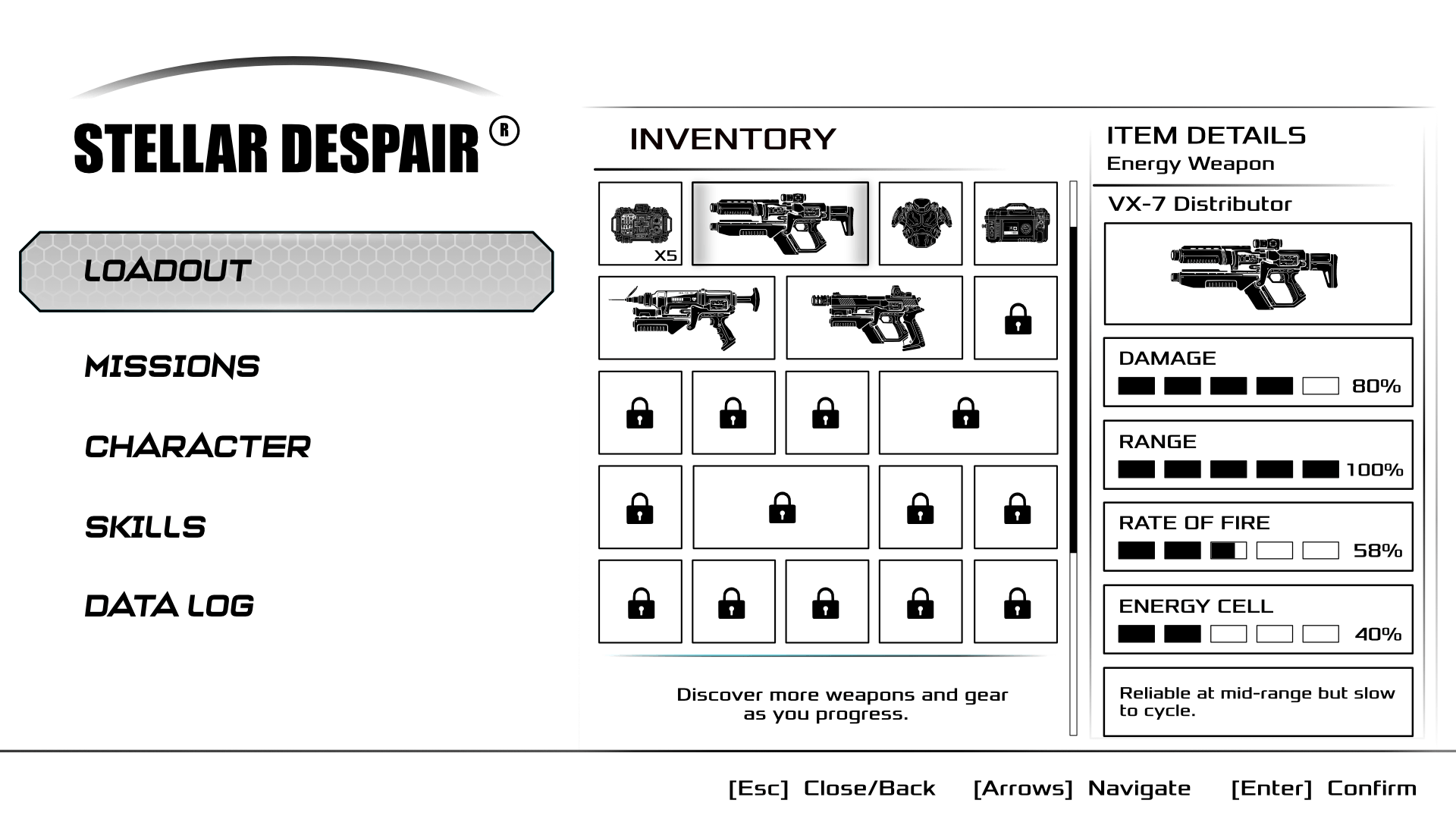
The inventory was designed around a modular grid system that can scale as new weapons, equipment, and collectibles are introduced. The layout keeps the selected item and its detailed statistics visible at all times, reducing unnecessary navigation. Clear visual hierarchy and generous spacing allow players to inspect equipment quickly without distracting from the game's aesthetic.
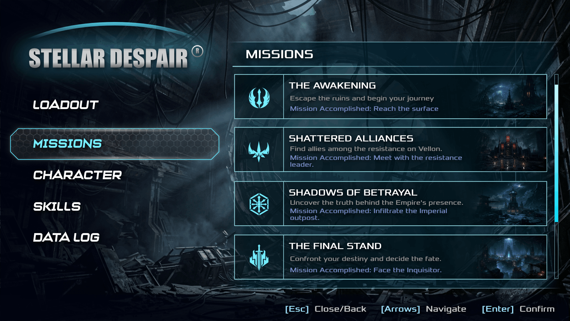
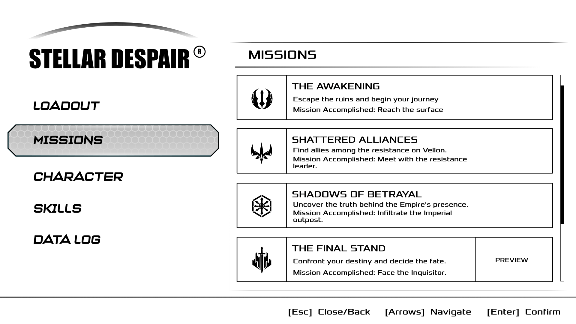
The mission interface organizes objectives into easily scannable cards that combine icons, artwork, titles, and progress information. This layout allows players to review their journey efficiently while reinforcing the narrative through visual previews. Consistent spacing and typography improve readability, even when managing a large number of missions.
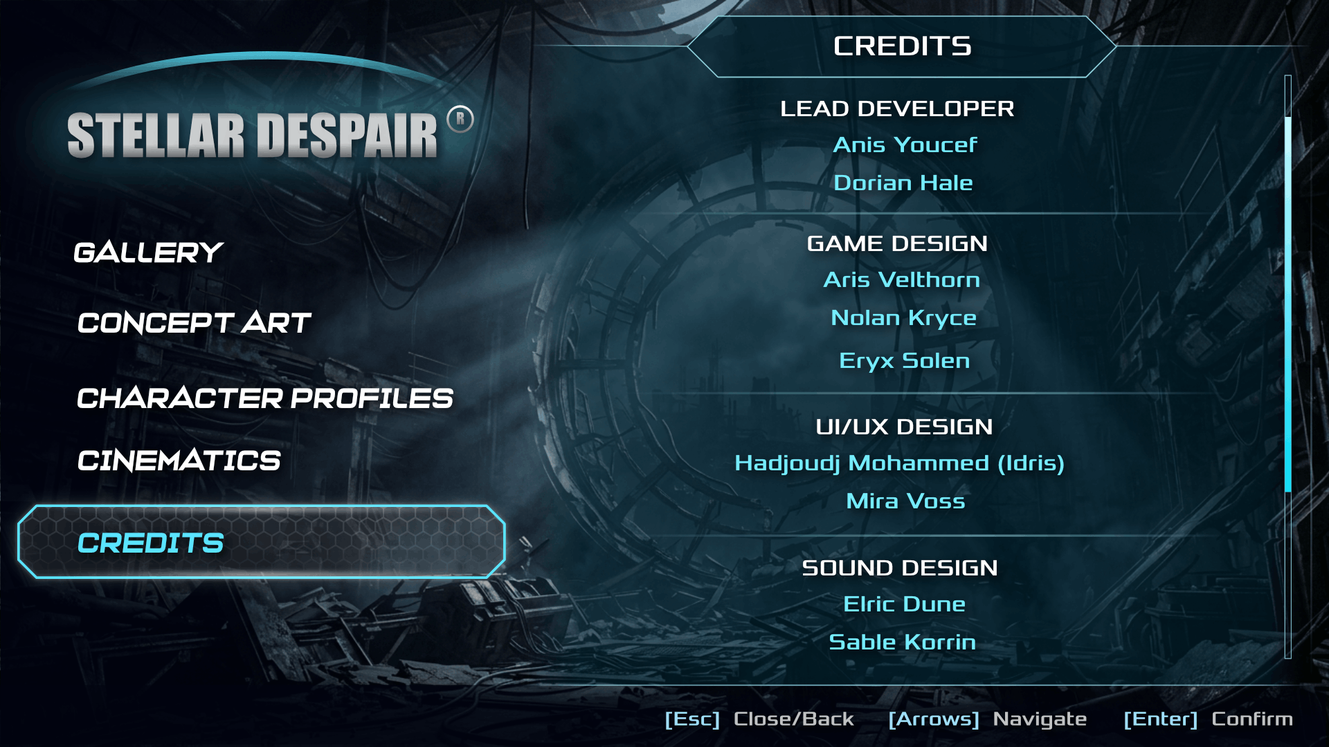
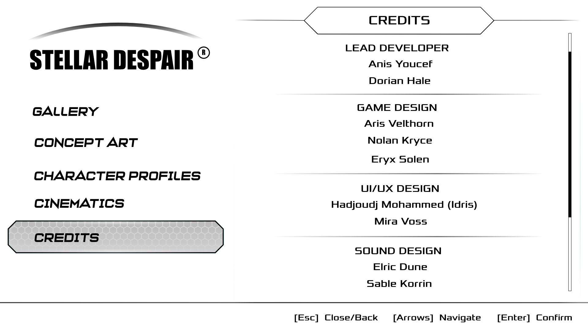
The credits screen follows the same visual language established throughout the interface, ensuring consistency even during non interactive sections of the experience. Clear typography, subtle separators, and scroll indicators provide a clean presentation while maintaining the immersive sci-fi atmosphere.


HTML Builder