Main menu design: what every game menu needs
It is the first screen anyone sees, it appears in every screenshot you will ever take, and it is usually designed in an afternoon near the end of production. Here is what belongs on it, in what order, and the decisions that make it feel like a real game rather than a template.
In this article
Open to new projects
Hadjoudj Idris
Game UI/UX Designer
Upwork100% Job SuccessView profile Hire me Browse the workA main menu is the cheapest possible place to look professional and the cheapest possible place to look unfinished. Nothing else in your game is seen by so many people who have not decided to buy it yet.
The short answer
At minimum a main menu needs the game's name, one obvious primary action, Continue when a save exists, Settings, Quit on PC, a version number, and input prompts on console. Put Continue first once a save exists, and leave it out entirely on first run rather than greying it out. Keep to four to six top-level items, and push credits, achievements and social links into a corner or a submenu.
Order the list by what players actually do
The default order in most engine templates is New Game, Continue, Options, Quit. That order is correct for exactly one session of one player's life, and wrong for every session after it.
Put Continue first, as the primary action, once a save exists. The overwhelming majority of launches after the first are returning players, and making them skip past New Game every single time is a small tax charged repeatedly. On the first run, when there is no save, Continue should not be present at all, and New Game takes the primary position.
First run and returning player are two designs
| State | Primary action | What changes |
|---|---|---|
| First run, no save | New Game | No Continue at all. Consider going straight into the game and showing the menu afterwards. |
| Returning player | Continue | Show what they are continuing: chapter, level, or time played. |
| Save completed | New Game or Chapter select | Continue is now misleading. Offer replay, new difficulty or post-game content. |
| Update available or news | Continue, unchanged | A quiet marker on a secondary item. Never a modal in front of Play. |
The second row is where menus earn goodwill cheaply. "Continue: Chapter 3, 4h 12m" tells a returning player the save is the one they expect, which removes a small anxiety they may not even articulate.
Four layouts that work
| Layout | Reads as | Best for |
|---|---|---|
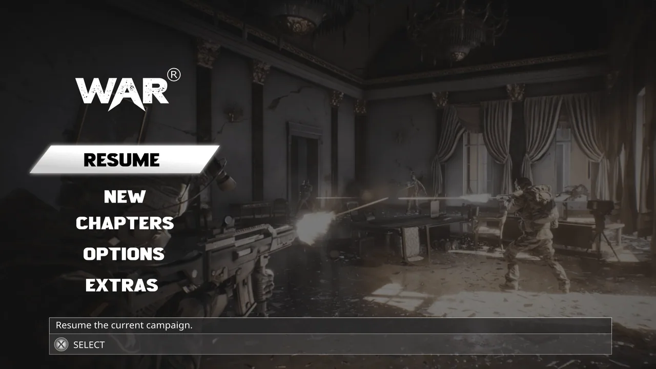
| Vertical list, left or centre | Classic, unambiguous, works on every input. | Almost everything. The safe, correct default. |
| Corner-anchored over key art | Cinematic, gives the art the screen. | Games whose art is the selling point. Needs disciplined contrast. |
| In-world or diegetic | Immersive, memorable, slower to read. | Horror, sim and narrative games where atmosphere beats speed. |
| Hub or dashboard | Dense, shows progression and live content. | Live-service, mobile, and games with modes and seasons. |
The vertical list is the correct answer far more often than its reputation suggests. It is not boring, it is solved, and the interest should come from the type, the art and the motion rather than from making the player hunt for the buttons.
Controller focus is the whole interaction
On a gamepad there is no cursor. The focus state is the only thing telling the player where they are, which makes it the most important visual state in the entire screen, not a subtle nicety.
- Something must be focused on arrival. A menu that opens with nothing selected leaves a controller player pressing directions to find out where they are.
- Focus must be obvious from ten feet away. A slight tint is not enough. Change fill, add a clear ring, or move the item.
- Define the order explicitly, including wrapping at the ends. Do not leave it to whatever the engine infers from the hierarchy.
- B or Circle goes back, everywhere, always. On the main menu, it should do nothing rather than quit.
- Never focus a disabled item. Skip it in the order entirely.
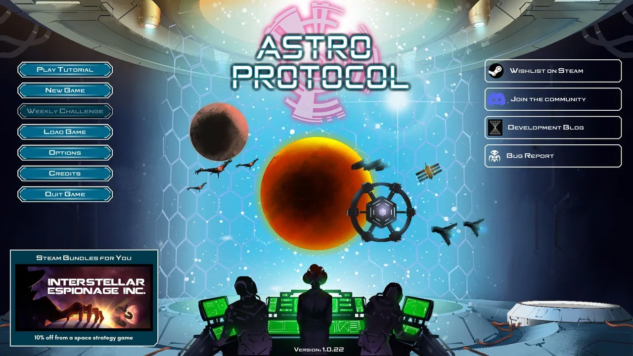
This is the same discipline the Astro Protocol menus were built with: primary confirmations in a fixed position on every screen, so the player learns one pattern and reuses it everywhere.
Type, contrast and the key art problem
The recurring technical problem with main menus is that the text sits over artwork, and artwork is not a uniform background. A label that is perfectly legible over the dark left third becomes unreadable when the art changes or the animation loops to a brighter frame.
- Give the text its own contrast, not borrowed from the art: a soft gradient scrim, a low-opacity plate, or a defined dark zone in the artwork itself.
- Test against the brightest frame of any animated background, not a static screenshot.
- Keep the type simple. One display face for the title, one readable face for everything else. A menu is not the place for four typefaces.
- Body and label text needs to survive TV distance. If it ships on console, read it standing across the room before signing it off.
Motion: what to animate, and what to leave alone
Motion is what separates a menu that feels expensive from one that feels static, and it is also the easiest place to overdo it and make the screen feel slow.
| Worth animating | Leave alone |
|---|---|
| Focus and hover transitions, 100 – 150ms | The primary action, looping forever |
| Screen-to-screen transitions, 200 – 300ms | Anything that delays the first input |
| A slow ambient background loop | Text that moves while you are trying to read it |
| The initial entrance, once | The entrance, replayed every time you return to the menu |
The rule that covers most of it: animation should acknowledge the player's input or set atmosphere in the background. It should never sit between the player and the thing they are trying to press. The durations, easing and transition rules are in UI animation.
Further reading
- Game UI Database: main menus from shipped games, to compare yours against.
- Xbox Accessibility Guidelines: guidance that applies to menus and focus states.
Hadjoudj Idris
Game UI/UX Designer, Remote, worldwide
Need this done properly on your game?
Menus, HUDs, a full UI system, or one screen that isn't working. Tell me what you're building and I'll tell you honestly whether I'm the right fit, and what it would cost.
Upwork100% Job SuccessView profile